Google Analytics Reports
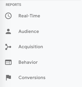
GA’s left-hand sidebar can be a bit overwhelming. You’ve got six reporting options (all with confusing, vague names), and clicking on any of those only gives you more options.
Let’s walk through each report together.
Google Analytics Real-Time Report
As the name suggests, the Real-Time report gives you insight into what’s happening on your site at this very moment. You can see how many visitors are on your site, which pages they’re visiting, which social platforms they’re coming from, where they’re located, and more.
While this report is fun to look at occasionally, it’s probably the least valuable. Here are some ways to use Real-Time:
- See how much traffic you’re getting from a new social or blog post
- Know immediately if a one-day sale or event is driving views and/or conversions
- Make sure tracking URLs and custom events that you’ve just set up are working as they should
These are useful, but as you’ll see, the other reports pack a far greater punch.
Google Analytics Audience Report
The GA Audience report gives you a high-level overview for the property you’re currently looking at. Check this report once a day to get a sense of how you’re trending overall.
Underneath "Overview," you’ll see "Audiences,” as well as expandable menus for "Demographics,” "Interests,” "Geo,” "Behavior,” "Technology,” "Mobile,” "Cross-Device,” "Custom,” and "Benchmarking.”
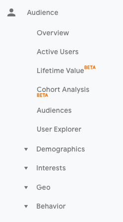
Explore each of these sections to get a sense of what they can tell you about your visitors.
Every section describes an audience.
Active Users
Whoever named this report belongs in the same group as the person who named guinea pigs: "active users” doesn’t refer to users currently on your site — that’s the Real-Time report — and guinea pigs are neither pigs nor from Guinea.
The Active Users report shows you the number of users who visited in the last day (1-day active users), week (7-day active users), two weeks (14-day active users), and four weeks (28-day active users.)
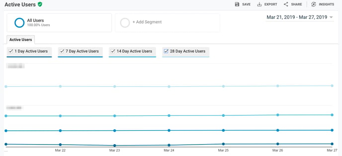
What’s the value of this report, you ask?
If you have more one-day users than longer-term ones, you’re struggling with retention. People aren’t coming back to your site or app — you need to figure out why.
I’d also recommend looking at this report with various segments; for instance, perhaps you see that users in a certain age bracket have much better retention than the average.
Lifetime Value
First things first: do you need a refresher on Customer Lifetime Value (CLV) and how to calculate it? We’ve got you.
The Lifetime Value report gives you a sense of how valuable users are to your company. You can see lifetime value for, say, the users you generated from email marketing versus the ones you acquired from organic search. Armed with this information, you can decide which channel to invest more in.
A few notes: Lifetime Value is capped at 90 days. The Acquisition date range, however — which you can adjust — reflects all the users you acquired in that time frame.
Imagine you’re interested in looking at transactions per user for users you acquired in the week before Black Friday. You’d adjust the date range to that week specifically. Then you’d see the average transactions per user for that cohort over the following 90 days.
Because HubSpot is a SaaS company, not an ecommerce business, I look at goal completions per user, page views per user, and sessions per user by Acquisition Channel.
If my team has recently wrapped up a marketing campaign, I’ll look at the same metrics by Acquisition Campaign.
But if you are in ecommerce and want to see transaction and revenue data, you’ll need to have ecommerce tracking set up.
(By the way, here’s how to track revenue in HubSpot.)
Cohort Analysis
Some people have gone so far as to call Cohort Analysis "the single most powerful report in GA.”
So, how does it work? This report groups users by one characteristic — so far, "Acquisition Date” is the only “Cohort Type” you can use. By the way, Acquisition Date is the day a user first visited your website.
You have several options from there.
- First, pick your cohort size: day, week, or month.
- Next, pick your metric, or what you want to explore for this cohort. It can be further broken down into Per user, Retention, and Total.
- Per user means the total count of that metric divided by the cohort size. So if you choose Transactions per user, for example, you’ll see the average number of transactions per user for that cohort.
- Retention is simple: user retention, or the number of users who returned that day, week or month (determined by the cohort size you selected) divided by the total number of users in that cohort.
- Total: the total number of sessions, transactions, etc. that occurred for that cohort size.
- Choose your date range. GA lets you see up to three months of data.
Now let’s dive into reading the report, because it’s not obvious.
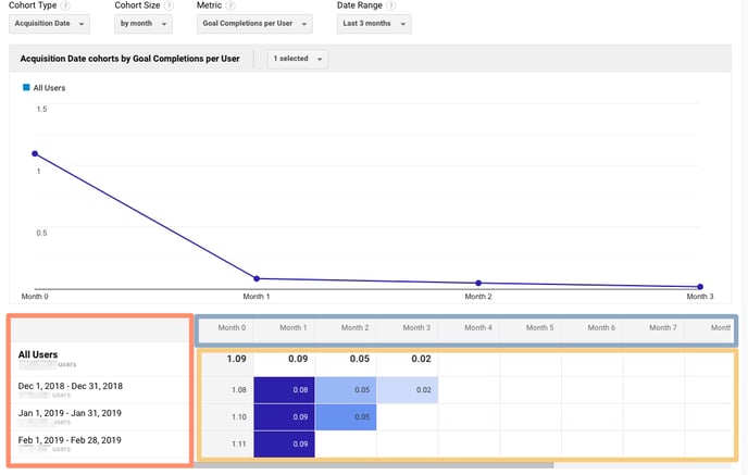
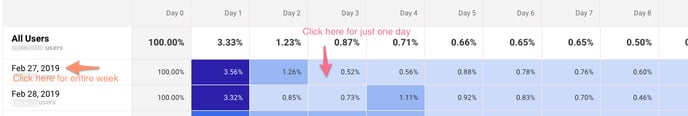
The left-hand column shows you the Cohort Type you picked — Acquisition date, by default — broken down by Cohort Size (day, week, or month).
The first row shows you the totals for all the users in that cohort. Each row underneath that represents the activity in that day, week, or month (in this example, we’re looking at month.)
The row outlined in light blue reflects the Cohort Size you’ve chosen. Remember that data only goes back three months at the max.
The row outlined in yellow shows you the values for the metric you chose (in this case, Goal Completions per User). In the eternal words of Calvin Harris: baby, this what you came for.
Look at the first row. This tells you the average goal completions for the entire cohort in the first month after they were acquired was 1.09. Average goal completions for the entire cohort in the second month after they acquired dropped to 0.09. By the last month, it’s 0.02.
Now look at the next three rows. It looks like average goal completions per user in the first month after they were acquired increased slightly from December to January and again from January to February.
This is pretty usual behavior. Let’s imagine that instead, this report tells us average goal completions per user for February 1-28, 2019 (the last row) was 4.07. Woah! That’s nearly four times as high as December and January.
We’d definitely want to investigate further. And to do so, all we have to do is right-click on the cohort we’re interested in.
Make sure you click on the column if you want the entire day, week, or month analyzed. Click on a cell if you want to analyze only the users who, for example, completed a goal three days after they were acquired on February 27, 2019.
When you right-click, this box will pop up:
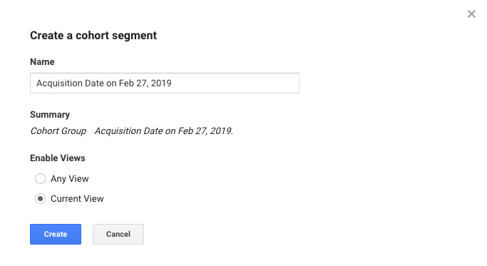
Give this cohort a descriptive name. Change the views to "Any View” if you want to use this segment across your entire property (which I usually recommend), then click "Create.”
Voila — now you can compare this cohort to any other segment in any report you choose.
Google Analytics Acquisition Reports
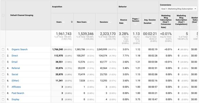
The Acquisition report breaks down your traffic by source: organic, direct, referral, email, social, paid search, display, affiliate, and (Other). (GA uses the (Other) category when it doesn’t know how to categorize a subset of traffic.)
From All Traffic, you can click into Channels.
Click on any category to explore each source in detail.
Depending on the category, you’ll see landing pages (which URLs your visitors entered the site on), source (which website brought them to yours), or keyword (which query took them to your site.)
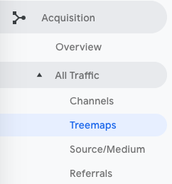
To see this information presented visually, click on All Traffic > Treemaps. This post walks you through how to read and adjust the Treemaps report.
The next report, Source/Medium, breaks down the general category of traffic (which you saw in “Channels”) into the search engine or domain.
It’s useful if you want to get more granular insight into the ways people are coming to your site. For example, you might notice that a whopping 70% of your referral traffic is coming from LinkedIn, while just 5% is coming from Pinterest. Depending on your marketing team’s priorities it may be time to shift focus.
The last report, Referrals, reveals the specific URLs that sent people to your site, e.g. your referral traffic.
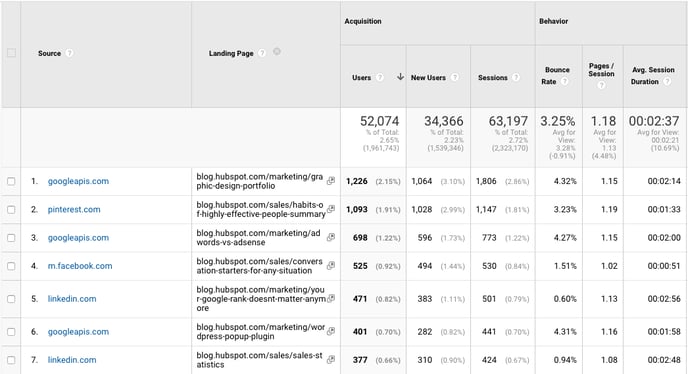
I like to add "Landing page” as a secondary dimension so you can see which pages on your site are receiving the referral traffic.
Google Analytics Behavior Reports
Out of all the reports in GA, I use the Behavior ones the most.
Site Content
This report gives you a review all of the blog posts, landing pages, web pages on your site.
All Pages
Let’s start with Site Content > All Pages. This shows the top-trafficked pages for your current view and/or segment. It’s useful in and of itself — you should always keep a careful eye on your most viewed URLs — but I especially like it when I’m analyzing traffic growth or declines.
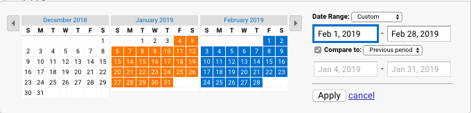
To give you an idea, maybe total traffic to my website has dropped 10% month over month. I’d navigate to Site Content > All Pages and change the date range to this month compared to the last month (making sure the days of the week match up).
Then I can see the differences in page views by URL:
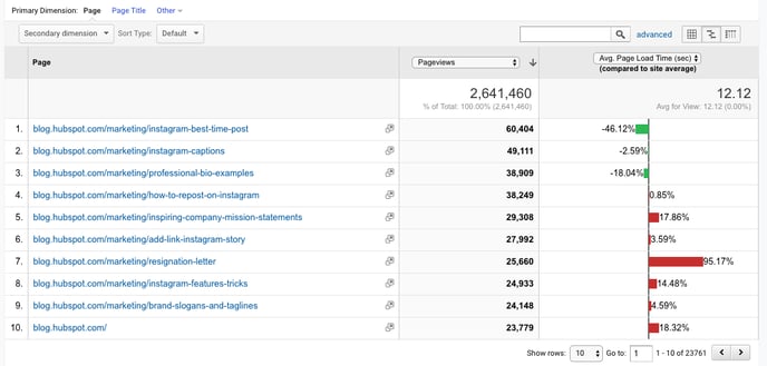
This helps me identify which pages received less traffic and contributed to that decline.
Helpful tip: I like to change the "Sort Type” from "Default” to "Absolute Change” so I see the results sorted by the greatest differences in percentage rather than total views.
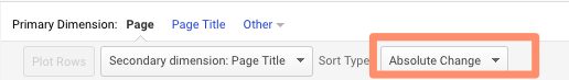
I also add Page Title as a secondary dimension so I can see the name of each page alongside its URL.
Content Drilldown
This report breaks down the structure of your site by subdomain and then subfolder. To give you an idea, for HubSpot we can see data for each of our subdomains, including:
- blog.hubspot.com
- developers.hubspot.com
- community.hubspot.com
And so on. If I clicked into blog.hubspot.com, I could then see aggregated data for:
- blog.hubspot.com/sales
- blog.hubspot.com/marketing
- blog.hubspot.com/service
You get the drift. This report is probably most valuable for those managing highly complex properties.
Landing Pages
Landing pages is another one of my favorite reports. GA defines a landing page as the first page in a session — in other words, the visitor’s first interaction with your website.
There are a few ways to slice and dice this report.
First, if you’re interested in the sources (organic, paid social, direct, etc.) driving users to the landing page, you can add Source/Medium as a secondary dimension.
This is basically the opposite version of the report we added earlier.
Second, if you only want to see which landing pages users visited from a specific source, on a specific platform, or within a specific category, you can add the appropriate system segment:
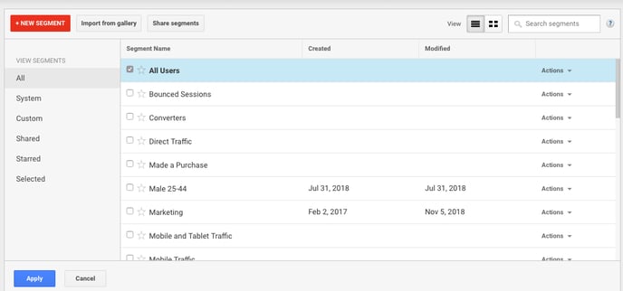
Maybe you’re most interested in the landing pages that mobile and tablet users see — so you choose the Mobile and Tablet Traffic.
Or perhaps you’re curious about users who ended up buying something, so you choose the "Made a Purchase” segment. There are lots of possibilities here.
Exit Pages
This report shows the last pages users visited in their sessions before they left your site.
That’s a little confusing, so let’s use an example.
I want to find a place to grab dinner with my friends so I search, "Mediterranean restaurants near me.” A place that looks good pops up, so I click on it. First, I check out the menu. They have a hummus sampler — yum. Then I click on their press page. It links to a recent article on Eater, so I leave the site to read it. The reviewer loved the food. I’m sold.
The Press page would be my exit page.
You may hear that you should analyze your exit pages to understand why users are leaving your site — I think this example reveals why that strategy doesn’t always make sense. Just because someone has left doesn’t mean anything is wrong with the content.
Check this report out but take the data with a grain of salt.
Site Speed
This report is pretty self-explanatory: it tells you how quickly your site is loading for users. Obviously, the faster the better — not only do faster pages correlate with higher revenue, but Google’s algorithm takes page load time into account.
Site Speed Page Timings
This report delves into the average page load times for each URL. I use it to identify the slowest-loading pages on HubSpot’s site with the ultimate goal of figuring out why they’re taking their sweet, sweet time and how to speed them up.
The default metrics are page views and average page load time, but I also recommend looking at:
- Avg. page load time and bounce rate
- Change the Sort Type to “Weighted” so you see the blog posts with the highest page views first
- Avg. page load time and page value
- The latter gives you a sense of how much a specific page contributes to your total revenue
- Looking at these two together helps you find slow-loading pages that are valuable to your bottom line (even if they don’t get a ton of traffic), making them a high priority to fix
Site Search
First things first: if users can search your website, make sure you’ve set up Site Search in GA. You must enable it for every view separately (here are the step-by-step instructions).
Usage
I typically start with the "Usage” report, which tells me how many sessions occurred with and without one-plus searches. In other words, I learn how frequently people used site search for the view and time period I specified.
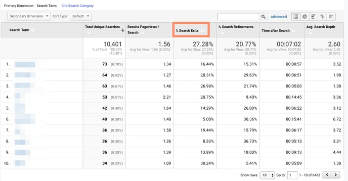
Search Terms
Here’s where you learn what people are searching for. Look for themes: if you see the same search terms coming up multiple times, there are a few conclusions you could draw.
Either you need to create new content that gives users the information they’re looking for, and/or you need to better surface existing content so it’s easier to find.
Pay attention to the "% Search Exits” column, as this tells you how many users clicked away from the search results page rather than choosing a result. You can usually infer there wasn’t a good answer for their question (or it wasn’t appropriately titled.)
Search Pages
This report displays which pages users are starting searches from. It’s important to think about this contextually. Maybe people are commonly beginning searches from your 404 page — that makes sense and isn’t anything to be alarmed about.
If, on the other hand, they’re starting searches from a product landing page, something’s wrong. The content clearly isn’t living up to the expectations they had when they clicked the ad link.
Loves Data provides a solid overview of GA’s Site Search reports if you want to explore them even further.
Events
A user clicks a button. Then they download a file. Next they watch a video.
No, this isn’t the world’s most boring bedtime story — it’s an example of a GA event. Three events, to be specific.
GA defines events as, "user interactions with content that can be measured independently from a web page or a screen load.”
Those user interactions are up to you; you’ll need to add special code to your site or app that tracks the specific actions you’re interested in. Here are the instructions.
If you’re not excited about events tracking already, I want you to get excited. There are infinite possibilities here: if you have an event set up for watching a product demo, and another for clicking a link to an external review of your tool, you can measure how many times each event happened.
Maybe you discover your video isn’t getting many plays. It’s probably time to optimize the current video, make it easier to find on your site, or create a new one. Or perhaps you see that way more users than you expected are checking out the third-party review of your product.
That tells you users want more social proof and testimonials. Since the review is favorable, you might want to put it front and center on your site.
Top Events
This report tracks the events taking place most frequently — pretty straightforward. You’ll see total events (e.g. how many times that event happened) and unique events (how many sessions included one or more occurrences of that event).
If you’ve set values for your events, this report also shows you how the total value of each event and its average value (or the total value divided by the frequency.)
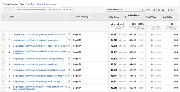
Pages
In this report, you can see which pages generate the most actions. I typically add "Event Category” as the secondary dimension, then filter for the event I’m most interested in.
To give you an idea, my team tracks "Blog CTA.” This event fires whenever a user clicks a CTA embedded in a blog post. To get to the report below, I added "Event Category” as the second dimension, then filtered for "Page begins with blog.hubspot.com” (so I’d only see URLs on the blog) and "Event Category equals Blog CTA.”
Now I can see which posts generate the most CTA clicks. Hopefully you’re starting to see the power of event tracking!
Events Flow
The Events Flow report tracks the order in which events take place on your site. It can tell you:
A) Whether particular events tend to happen first — and if they trigger other events
To give you an idea, maybe users frequently watch your demo video, then click the CTA to schedule a call with a salesperson.
B) Whether certain event categories are more common than others
Imagine you see that videos are played far more often than PDFs are downloaded.
C) Whether users act differently based on segment
For example, perhaps people coming in via organic scroll to the bottom of your pricing page far more than people coming in via social media.
Note: This report is very subject to sampling. (Read more about GA’s data sampling practices here.) Sampled data is usually pretty accurate, but it means the more important the conclusion you’re drawing, the less uncertainty you’ll be able to tolerate.
To reduce the level of sampling, make the date range smaller.
Publisher
If you monetize your website with Google AdSense or Ad Exchange, you can use the Ad Manager and Google Analytics integration to bring information on how your ad units are performing into GA.
I won’t go into any more detail here, but I recommend reading the following resources if you want to know more:
Google Analytics Conversion Reports
If you have a website, you have an objective — probably several — for the people who visit your site.
Ecommerce store owners want their visitors to subscribe to their mailing list, make a user account, add something to their cart, and/or complete the order confirmation process.
Media companies want their visitors to stay on their site for as long as possible and/or view a certain number of pages (all the better to maximize their ad revenue.)
B2B businesses want their visitors to download an ebook, sign up for a webinar, or book a call with a sales rep.
Google Analytics makes it possible to measure all of these things — plus many more.
A goal is essentially a conversion that you’ve defined (which is why this info shows up under the Conversion section.)
There are four main types of goals:
- Destination: This goal is completed when a user reaches a specific page, like a product page, order confirmation page, or thank you page
- Event: This goal is completed when a predefined event fires (like the Events you can set up as, well, Events — think watching a video or sharing something to social media)
- Duration: This goal is completed when a user’s session lasts longer than a pre-set time
- Pages/screens per session: This goal is completed when a user views a specific number of pages (or screens for an app) per session
The first two are insanely useful. The last two are pretty useless. (If you have an interesting use case for Duration or Pages/screens per session, let me know on Twitter @ajavuu. I’d love to be proven wrong.)
Once you’ve identified your goals, take a look at these instructions for creating, editing, and sharing them. This guide on choosing goal values is also quite helpful.
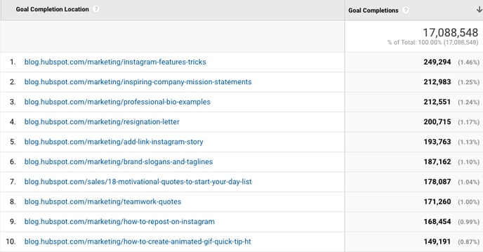
Overview
Head here to learn how you’re doing goal-wise across the board. I get the most from this report when I compare date ranges and/or look at goal completions by segment.
For example, quickly looking at goal completions by device reveals mobile visitors sign up for the blog newsletter much less frequently than desktop and tablet visitors. That could be because it’s hard to sign up for the newsletter on a phone — or it could be mobile users are looking for one thing and ending their session as soon as they’ve found it. I should dig in more to decide which case it is.
Goal URLs
Knowing a goal was completed isn’t helpful in and of itself; you also need to know where it happened. Suppose you’ve embedded the same form in three separate pages on your site.
It’s great that Daenerys Stark from Dragonstone, Blackwater Bay just filled out your form to get in touch with a consultant, but which page did she fill it out on?
The Goal URLs report shows you. It breaks down conversions by "Goal Completion URL” (read: where it went down.)
Reverse Goal Path
Reverse Goal Path is the unsung hero of the Conversion section. Well, I’m singing its praises now. This report allows you to see the last three pages a user visited before completing the goal.
It’s useful for goals that aren’t sequential. Maybe you have a contact form that appears in multiple places on your site, or there are two different paths that lead users into buying your ebook. Thanks to this report, you can understand the various ways people arrive at the end destination — and there’s no need to set up a funnel.
I usually filter down to a specific goal completion location or goal previous step 1, 2, or 3.
For example, since I’m interested in seeing which blog posts generated leads from content downloads, I added "Goal Previous Step - 1 containing blog.hubspot.com” to the filter.
Here’s what I got:
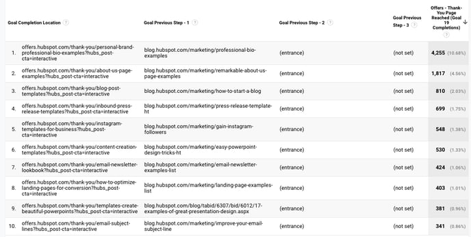
"(Entrance)” means the user came to the site on that step; "(not set)” means the user didn’t complete any steps prior to that one — because they weren’t on the website yet.
For a comprehensive exploration of Reverse Goal Path, take a look at OnlineMetrics’s guide.
Funnel Visualization
For sequential goals, Funnel Visualization is your go-to report.
Going back to the ecommerce example, the last goal would be "Arrived at the order confirmation page.” The goal before that, or goal #3, would be "Clicked checkout.” The goal before that, goal #2, would be "Added something to cart.” And the goal before that, goal #1, would be "Looked at product listing page.”
At each stage, you can see user drop-off. That lets you identify areas where you can improve conversion rates; for example, maybe you lose a lot of users during the checkout process. You change the flow so they can check out as a guest (versus needing to create an account), which dramatically reduces checkout abandonment.
To see this level of detail, you’ll need to map out your goals as a series. If all of your goals are simply the end objective, like "Arrived at the order confirmation page,” you won’t be able to reverse-engineer how users progress.
The Funnel Visualization report also requires you to mark the first step in the goal path as required or not. If you tell GA that yes, the first goal needs to be completed, Funnel Visualization will only show you the sessions where the user first finished goal #1. If a user skips goal #1 and goes straight to goal #2, their session won’t be represented here.
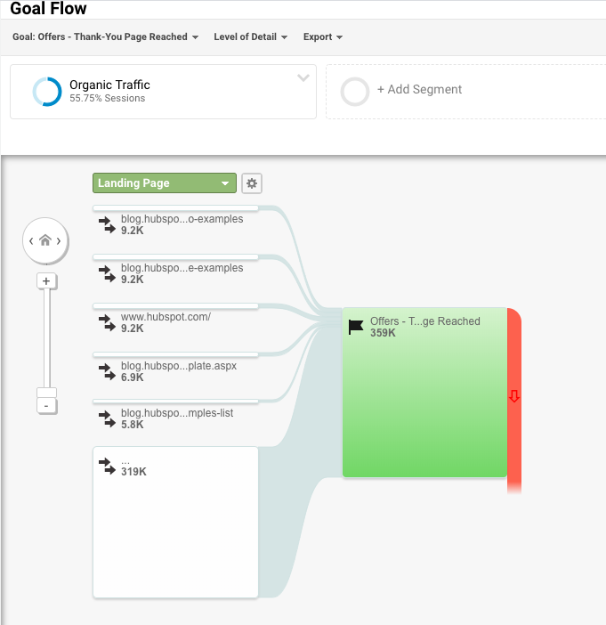
Goal Flow
If Funnel Visualization is the uptight relative who always made you take your elbows off the table and wash your hands before you ate, Goal Flow is the laid-back, fun relative who’d randomly take you out of school to go to the zoo.
All that to say: Goal Flow gives you a lot more freedom than Funnel Visualization. Unlike the latter, Goal Flow shows you all sessions that led to the completed end goal — regardless of whether the user completed the required goal #1 or not.
Another difference from Funnel Visualization: Goal Flow also shows you loopbacks — i.e. when a user goes back to a previous page or refreshes their current one.
If the user skips a step, Funnel Visualization "backfils” it. Goal Flow doesn’t.
If you edit an existing funnel or create a new one, Funnel Visualization will show you all your data from that moment onward. Goal Flow, on the other hand, can show you data from the past.
You can also toggle the Dimension and Level of detail of the report, as well as the segment, to get even more granular.
I recommend looking at various segments to see which convert at the highest and lowest rates — plus where they commonly drop out.
Note: This report is subject to sampling. (Read more about GA’s data sampling practices here.) Sampled data is usually pretty accurate, but it means the more important the conclusion you’re drawing, the less uncertainty you’ll be able to tolerate.
To reduce the level of sampling, make the date range smaller.
Smart Goals
This report is helpful if you’re A) using Google Ads and B) not measuring conversions. Basically, Google uses machine learning to identify your "best” sessions — or those likeliest to generate conversions — and then translates those themes into Smart Goals.
Once you have Smart Goals, you can use them in Google Ads to optimize your ads performance.
Smart Goals are controversial within the marketing community because the data is minimal and businesses will be far better served by setting up their own conversion tracking. Keep that in mind if you decide to use them.